Client
Aung Bar Lay Online Lottery App
Role
UX Designer
TImeline
4 weeks
tools
Figma
Overview
After the first month of the launch of the Aung Bar Lay Online Lottery app, stakeholders were observing low conversion rates on the app's website. Site analytics revealed that visitors were clicking on the download buttons available on the site, however this was not reflected in the actual number of downloads.
Research into user feedback revealed that many people were turning to the online community to gain clarity on steps to take after clicking download. This revealed that there was an opportunity to create a better way to educate users on the app's unconventional download process.
User observation tests showed that upon first landing on the site, visitors had difficulty locating the download instructions, which were located further down the page. My team and I hypothesized that the conversion rate would improve if we provided a better wayfinding system in the header that led visitors down the page to the download instructions.
As the lead UX Designer on this project, I supported my team with research, designing, testing, iterating, and launching. I successfully helped deliver a new site design that was more relatable and familiar to our audience, improving the conversion rate of visitors to downloads.
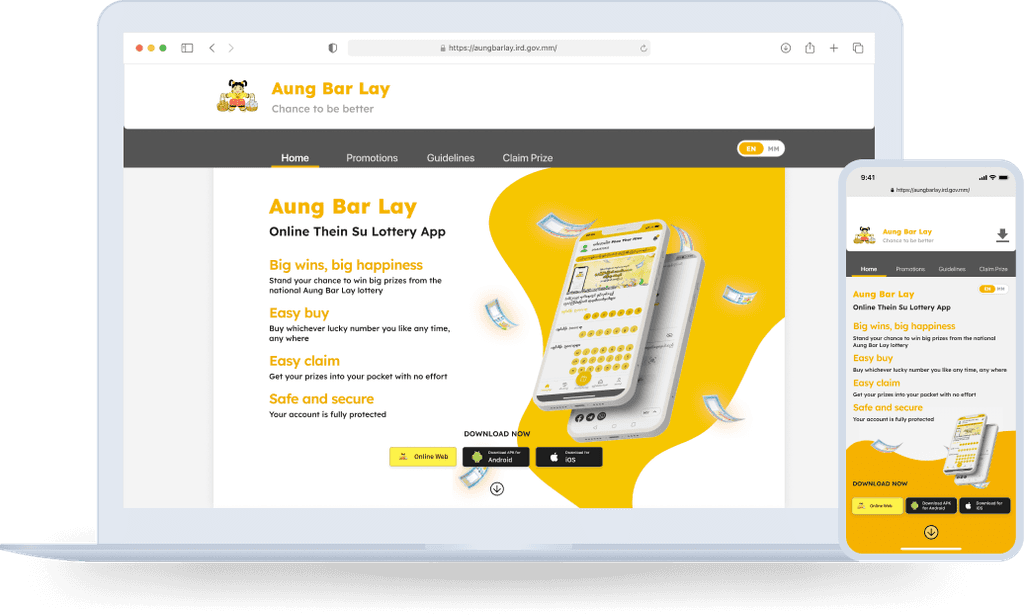
Redesigned Aung Bar Lay website mock up
Opportunity
The website for the Aung Bar Lay Online Lottery mobile app served as an hub for visitors to access download links and instructions, which was particularly necessary due to the app's complex availability. It played a vital part in facilitating smooth user onboarding and ensuring cross-platform accessibility for users with various operating systems.
However, after a month of the launch of the app, the site was producing low conversion rates of visitors to actual downloads, according to stake holders. This issue led to the conception of this project.
GOALs
Get visitors of the website to successfully complete the user journey.
Increase the conversion rate of visitors into app downloads.
Actions
Unusual Challenges
According to stakeholders, the app's biggest challenge since launching has been educating people on the unconventional download process.
This was due to two main reasons:
Non-traditional distribution: When the app initially launched, it wasn’t available on any of the traditional app stores, resulting in a complicated and tedious download process that the public was not familiar with.
Device-specific complexity: The download processes also varied based on the user's device operating system, adding another layer of complications.
For these reasons, it was crucial for visitors to easily navigate to the download instructions in order to convert them into users.
Understanding Our users
To learn about our audience's FAQs and pain points with the current site, I turned to online community forums and social media groups where our users congregated. This was my key insight:
Users didn't know what to do after clicking the download app button.
Interestingly enough, the answers were already available on the site. However, after some more digging, I found two possible reasons for this persistent issue:
Download instructions were only available on the mobile view, entirely overlooking desktop users.
Header and hero section were lacking CTA's and wayfinding systems that led the user down to the download instructions.

Previous Aung Bar Lay Website

Previous Aung Bar Lay Mobile Site
We need to provide users with clear information and guidance, inspire a sense curiosity, encourage discovery, and remove any learning curves.
strategizing together
I hosted a brainstorm and sketch workshop with the team to strategize. We voted on the following design that we believed would be most suitable for our audience:
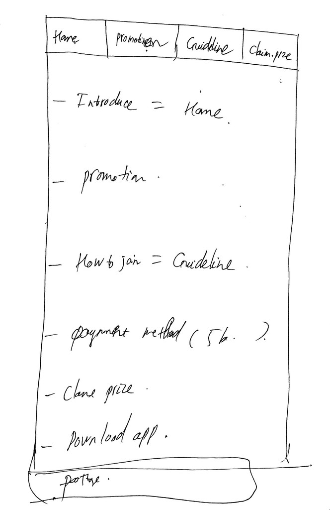
Sketch from stakeholder workshop
The sketch depicts a single-page website with a header containing navigation tabs that would stay fixed at the top of the screen regardless of scroll position. The tabs would allow the user to jump from one section to another while always remaining accessible.
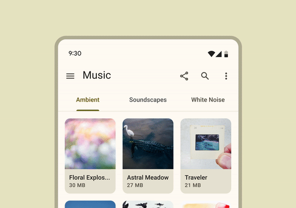
If this looks familiar, that's because we drew inspiration from Android UI patterns. Below is an example from Google's open-source design system.
why this design?
We chose a mobile UI pattern as our inspiration for both desktop and mobile views because according to my research, as of June 2023, almost 70% of internet traffic in Myanmar came from mobile devices (Figure 1).

Figure 1: Device Market Share in Myanmar (2023)
why Android UI?
Furthermore, we chose UI patterns from Android specifically because as of October 2022, 90% of all the mobile operating systems in Myanmar was Android (Figure 2).

Final solutions
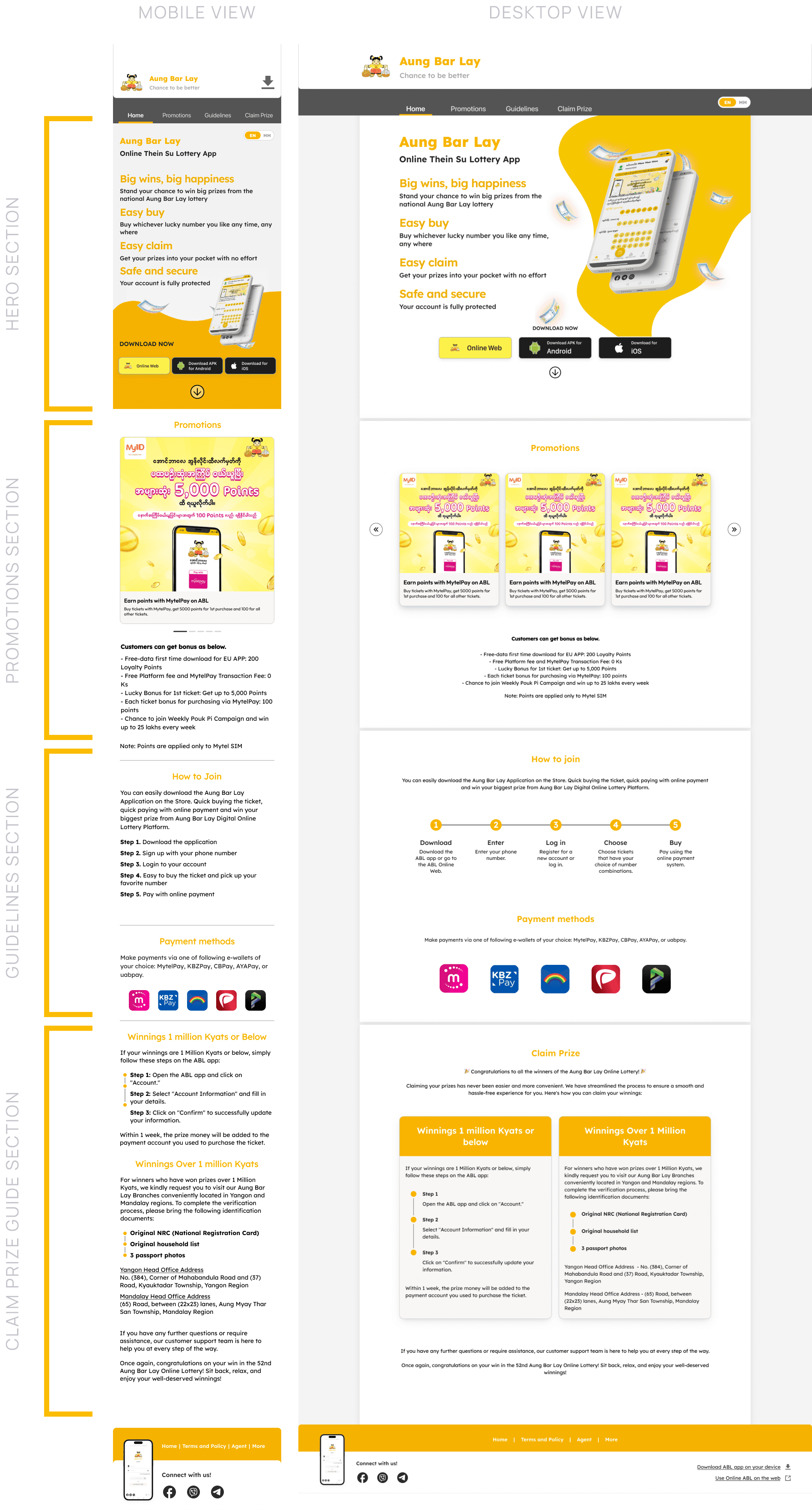
Mobile-First Approach
With all this in mind, I began developing my prototype in Figma. Since most of our traffic would come via mobile devices, I took a mobile-first design approach. I identified three key areas of the website to address: the header, page sections, and footer.
hEader
To the header, I added a navigation system inspired by Android UI patterns. The clearly defined tabs would allow the user to jump to any section in the page at any time. The header would remain at the top of the page regardless of scroll position, so that it was always accessible by the user.

Final Prototype - Navigation system demo (Mobile view)

Final Prototype - Navigation system demo (Desktop view)
Page Sections
Next, I made changes to the page sections, starting with fixing the overall layout by making spacing adjustments and improving responsiveness. I then split the remaining content into three sections.
In the initial iteration, this was the order of the sections from top to bottom:
Hero section containing CTA's to download the app and explore further down the page.
Guidelines for app download and account registration.
Current promotions that showcased the latest deals.
Instructions for claiming prizes for lottery winners.
Upon sharing this iteration with stakeholders, the feedback given was to move the promotions section up higher so that it comes right after the hero section. After finding that this change would not negatively impact our goals through user testing, I made updated the prototype as seen below.
Final Prototype - Content Sections
Footer
Finally, I made better use of the bottom of the page allocated to the footer by adding a helpful sitemap and more CTA's to download the app and engage with the Aung Bar Lay social media accounts.

Final Prototype - Footer
Impact
The new site design increased the conversion rate of visitors to app downloads much closer to 100%. The addition of navigation tabs made it easier for visitors to find relevant information quickly. The new page sections provided clear and concise instructions, resulting in a higher success rate for the completion of the user journey. Overall, the website's user experience was significantly enhanced, contributing to increased user acquisition.