Project
AYA Mobile Banking
Role
UX Designer
TImeline
6 Weeks
tools
Figma
Impact
We transformed AYA Mobile Banking's home page from a lack-luster entry point filled with navigation issues, scattered data, and privacy concerns into a clear, personal financial hub.
By bringing out key features, protecting sensitive information, and automating manual tasks, the new design expedited key banking tasks and enabled the user to feel in control of their finances at all times.
Time to locate features are
75%
Faster
Cut down number of taps to access features to just
1
Tap
Steps required to view recent activity
0
Steps
Displaying total balance resulted in
0
Manual Calculations
Pain Points
After conducting user interviews with 6 mobile banking users in Myanmar between the ages of 25 and 45, we uncovered frustrations and recurring pain points, which provided valuable insights to guide design decisions.
Navigation Issues
Users found the hamburger menu unorganized, labels and icons unclear, making it hard to find features and start tasks.
Scattered Info
Users had to do manual calculations to check total balance and access transaction history since information was dispersed across multiple layers.
Privacy Concerns
Lack of privacy in public environments because all financial information is immediately visible upon login.
Strategy & Solutions
To streamline navigation, surface key actions while protecting sensitive information, and automate tedious manual tasks.

Simplify Navigation & Prioritize Essential Tasks
Show
Reduced time to locate features by 75% and cut number of taps to just 1 click with simple labels, mobile-friendly nav bar, and quick actions icons on the home page.

Enhance Transparency & Automate Manual Tasks
Show
No more manual calculations for users to find out total account balance. No clicks needed to view recent account activity. Users automatically get an overview of their finances upon login.
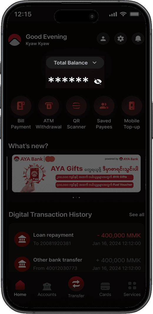
Maintain Privacy For Sensitive Information
Show
Leveraged the home page as a safe starting point for accessing sensitive data, now located one level deeper in the hierarchy, preventing accidental exposure of sensitive data while remaining accessible.
Outcome
Previously, key actions were hidden in menus, sensitive information was fully exposed, users had to manually calculate total balances, and checking recent activity required multiple taps. This made everyday digital banking slow, effortful, and a chore.
The data shows that the new home page design dramatically reduced effort and friction. Users can now get an instant overview of finances by simply logging in and access key features in a single tap right from the home page while maintaining privacy.
These improvements demonstrate that an informative, prioritized, and protected home page directly boosts efficiency, confidence, and overall satisfaction.