Project
AYA Mobile Banking
Role
UX Designer
TImeline
6 Weeks
tools
Figma
Impact
Through a complete redesign of AYA Mobile Banking’s core banking flows, we reduced transaction time by rough half, simplified user journeys across key tasks, and increased overall task completion rates.
With new features like Transfer to Wallet and enhancements to Loan Repayment, the new AYA Mobile Banking platform distinguishes itself from the previous version, driving higher user engagement and attraction.
These enhancements contribute to a seamless experience across the AYA ecosystem and promote safe, positive financial habits.
Pain Points
After conducting user interviews with 6 mobile banking users in Myanmar between the ages of 25 and 45, a competitor analysis with 6 banking apps, and a usability audit, we uncovered frustrations and recurring pain points, which provided valuable insights that guided design decisions.
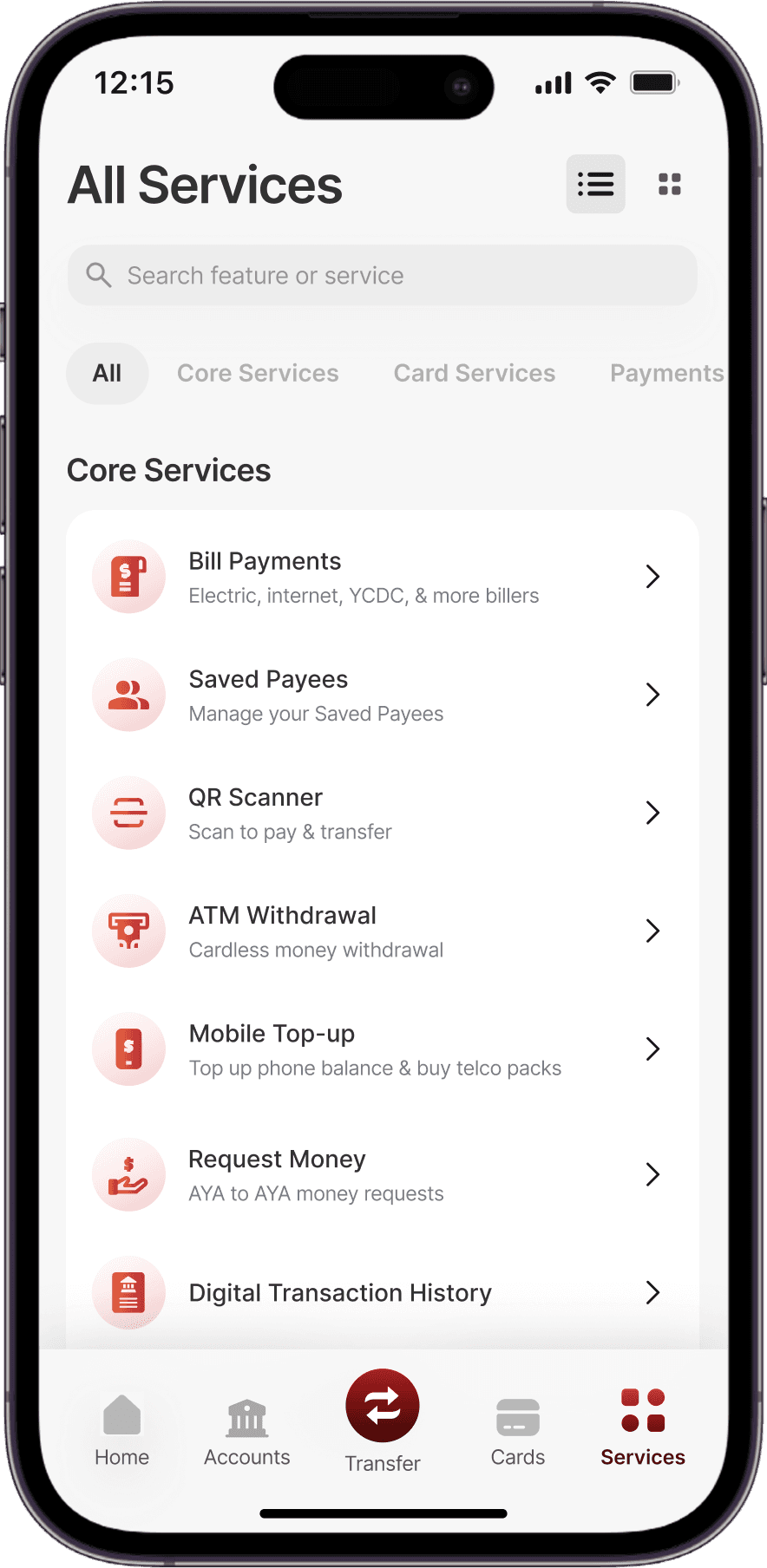
Confusing IA
During tasks, users spent about 30% of the time in the main menu locating the relevant feature due to unclear labels and poor organization.
80% of users struggled to return to the home page after finishing a task due to lack of a clear path.
Low Awareness
Most participants unaware of Fast Pay and Personal Financial Management, resulting underutilized services.
50% of participants were not aware about the distinction between Interbank and Fast Interbank features.
Confusing labels and similar-sounding feature names caused users to hesitate or make wrong choices.
Low Accessibility
Small text and touch targets caused accessibility issues for users, especially older folks and those with sight issues.
Weak visual hierarchy makes difficult for users to scan and spot important information quickly.
All users perceived the app as outdated and less trustworthy due to outdated UI design.
Slow Task Completion
All users found the SMS OTP authentication unreliable, reporting frequent delays that slowed down transfers.
Since bank accounts were represented only by account numbers, users took longer to choose payment account during transfers compared to competitor platforms.
Loan repayment process was fragmented and lengthier than competitors platforms.
Strategy & Solutions
To address the most critical pain points, we reimagined the AYA Mobile Banking experience through four core strategic pillars: guide users through intuitive navigation, help users finish tasks quickly, drive effortlessness, and build trust.
Navigation |

Reprioritize Information Hierarchy
Show
Reduced time to locate features by 75% and cut number of taps to just 1 click with simple labels, mobile-friendly nav bar, and quick actions icons on the home page. Also provided clear path back to home after every task.
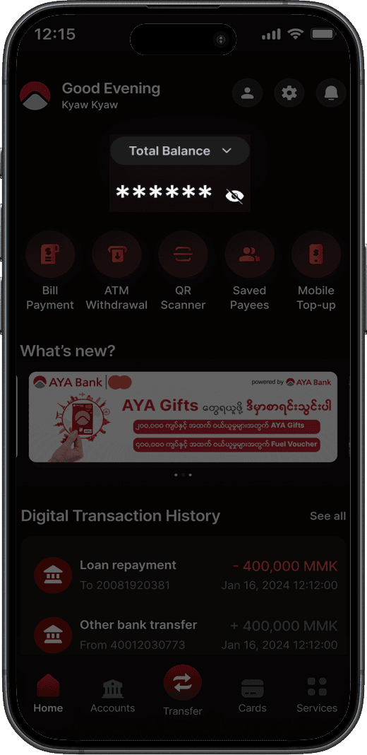
Provide Relevant Labels and Contextual Prompts
Show
No more manual calculations for users to find out total account balance. No clicks needed to view recent account activity. Users automatically get an overview of their finances upon login.
Always Provide a Consistent Path Back to Home
Show
Leveraged the home page as a safe starting point for accessing sensitive data, now located one level deeper in the hierarchy, preventing accidental exposure of sensitive data while remaining accessible.
Unify fragmented features & Streamline User Journeys |

Unify Loan Feature
Show
Reduced time to locate features by 75% and cut number of taps to just 1 click with simple labels, mobile-friendly nav bar, and quick actions icons on the home page.

Streamline Loan Repayment Process
Show
Reduced time to locate features by 75% and cut number of taps to just 1 click with simple labels, mobile-friendly nav bar, and quick actions icons on the home page.
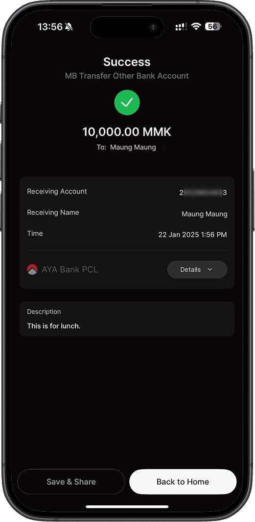
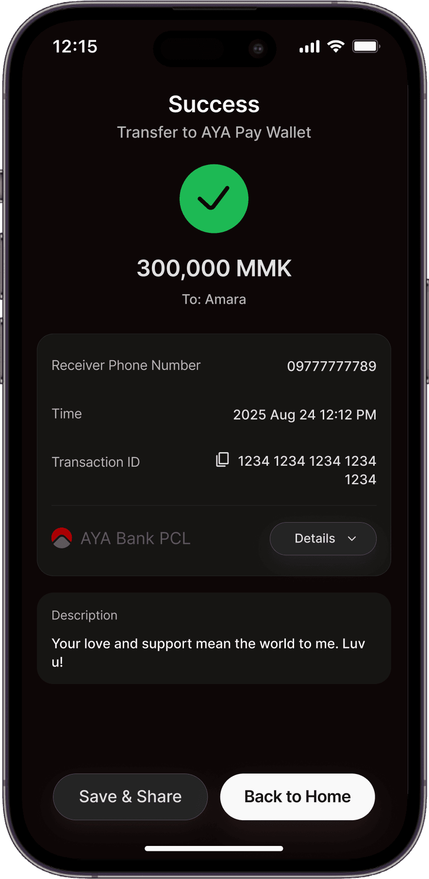
Streamline Journey For Transferring To Other Bank
Show
No more manual calculations for users to find out total account balance. No clicks needed to view recent account activity. Users automatically get an overview of their finances upon login.
Optimize Flow For Transferring From Bank to E-Wallet
Show
Leveraged the home page as a safe starting point for accessing sensitive data, now located one level deeper in the hierarchy, preventing accidental exposure of sensitive data while remaining accessible.
drive effortless interactions
Save Users Time & Effort With Smart Defaults
Show
Reduced clicks and improve efficiency through smarter defaults for key flows such as transfers and payments.

Provide Multiple Reliable Authentication Methods
Show
Introduced quicker and more reliable authentication with the new Transaction PIN, Viber OTP method, and biometric approval.
Support Personalization
Show
Enabled users to give custom names to bank accounts and save frequent payees, saving time that would be otherwise wasted during key flows like Transfer.
Outcome
Redesigning everyday essential tasks that form the core of the AYA Mobile Banking app not only improved usability and accessibility, but also strengthened AYA’s brand perception as a trusted, user-first bank. This redesign shows how thoughtful UX can drive adoption and satisfaction of digital banking. This project deepened my understanding of designing for diverse digital literacy levels and the importance of aligning UX with cultural context.